Apply Segment by Segment ID
This example pulls the top 10 pages for the last thirty days, for visits where the entry page included the word “Intelligence”. We’ll do this by referencing a segment that was built in the Adobe Analytics web UI.
Setup/Config
Be sure you’ve completed the steps on the Initial Setup page before running this code.
For the setup, we’re going to load a few libraries, load our specific Adobe Analytics credentials, and then authorize with Adobe.
# Load the necessary libraries. The 'typical' way to do this is with a series of
# 'library([library name])' calls. The use of the pacman package, though, adds a
# check that will install any missing packages before then loading them.
if (!require("pacman")) install.packages("pacman")
pacman::p_load(RSiteCatalyst,
               tidyverse,
               jsonlite)    # Needed for unbox() in examples with inline segments

# Load the username, shared secret, and report suite ID
username <- Sys.getenv("ADOBE_API_USERNAME")
secret <- Sys.getenv("ADOBE_API_SECRET")

# Authorize Adobe Aalytics.
SCAuth(username, secret)

# Set the RSID and the date range. If you want to, you can swap out the Sys.getenv()
# call and just replace that with a hardcoded value for the RSID. And, the start
# and end date are currently set to choose the last 30 days, but those can be
# hardcoded as well.
rsid <- Sys.getenv("ADOBE_RSID")
start_date <- Sys.Date() - 31        # 30 days back from yesterday
end_date <- Sys.Date() - 1           # Yesterday
If that all runs with just some messages but no errors, then you’re set for the next chunk of code: pulling the data.
Pull the Data
The key step here is figuring out the ID of the segment that you want to use. The easiest way to find this is to use the GetSegments() function:
segs <- GetSegments(rsid)
That will create a data frame that you can then view/filter to find the specific ID you want to use, which you can then copy and paste into the actual data pulling code.
# Pull the data. See ?QueueRankes() for details on the arguments available.
aa_data <- QueueRanked(rsid,
                       date.from = start_date,
                       date.to = end_date,
                       metrics = "pageviews",
                       elements = "page",
                       top = 10,
                       segment.id = "s300003965_5aad9f5c22fa9942088629ea")

# Go ahead and do a quick inspection of the data that was returned. This isn't required,
# but it's a good check along the way.
head(aa_data)| name | url | pageviews | segment.id | segment.name |
|---|---|---|---|---|
| Search Discovery, Inc. - A Digital Intelligence Company | https://www.searchdiscovery.com | 1694 | s300003965_5aad9f5c22fa9942088629ea | [Hit] Page contains “Intelligence” |
| About Our Digital Intelligence Company | Search Discovery | https://www.searchdiscovery.com/about | 719 | s300003965_5aad9f5c22fa9942088629ea | [Hit] Page contains “Intelligence” |
| Digital Marketing, Analytics and Business Intelligence Jobs at Search Discovery | https://www.searchdiscovery.com/about/careers | 702 | s300003965_5aad9f5c22fa9942088629ea | [Hit] Page contains “Intelligence” |
| Search Discovery, Inc. - A Business Intelligence and Analytics Company | http://searchdiscover.staging.wpengine.com | 661 | s300003965_5aad9f5c22fa9942088629ea | [Hit] Page contains “Intelligence” |
| Digital Intelligence Solutions | Search Discovery | https://www.searchdiscovery.com/solutions | 369 | s300003965_5aad9f5c22fa9942088629ea | [Hit] Page contains “Intelligence” |
| Business Intelligence and Analytics Solutions | Search Discovery | http://searchdiscover.staging.wpengine.com/solutions | 236 | s300003965_5aad9f5c22fa9942088629ea | [Hit] Page contains “Intelligence” |
Data Munging
In order to keep the order in the bar chart, we need to convert the page column to be a factor. We’ll reverse the order so that, when displayed in a bar chart, they’ll be in descending order.
# Convert page to be a factor
aa_data$name <- factor(aa_data$name,
                       levels = rev(aa_data$name))
Data Visualization
This won’t be the prettiest bar chart, but let’s make a horizontal bar chart with the data. Remember, in ggplot2, a horizontal bar chart is just a normal bar chart with coord_flip().
# Create the plot. Note the stat="identity"" (because the data is already aggregated) and
# the coord_flip(). And, I just can't stand it... added on the additional theme stuff to
# clean up the plot a bit more.
gg <- ggplot(aa_data, mapping = aes(x = name, y = pageviews)) +
  geom_bar(stat = "identity") +
  coord_flip() +
  theme_light() +
  theme(panel.grid.major.y = element_blank(),
        panel.grid.minor.y = element_blank(),
        panel.border = element_blank(),
        axis.title.y = element_blank(),
        axis.ticks.y = element_blank())

# Output the plot. You *could* just remove the "gg <-" in the code above, but it's
# generally a best practice to create a plot object and then output it, rather than
# outputting it on the fly.
print(gg)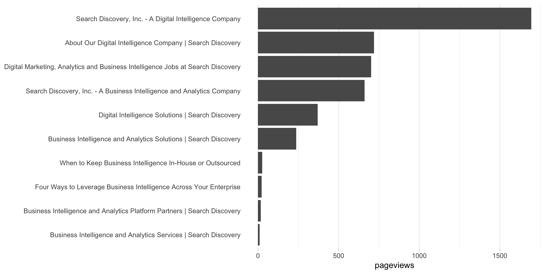
This site is a sub-site to dartistics.com