Traffic by Device Type
This example pulls visits by device type for the last 30 days and then plots the data on a line chart.
Setup/Config
Be sure you’ve completed the steps on the Initial Setup page before running this code.
For the setup, we’re going to load a few libraries, load our specific Adobe Analytics credentials, and then authorize with Adobe.
# Load the necessary libraries. The 'typical' way to do this is with a series of
# 'library([library name])' calls. The use of the pacman package, though, adds a
# check that will install any missing packages before then loading them.
if (!require("pacman")) install.packages("pacman")
pacman::p_load(RSiteCatalyst,
               tidyverse,
               jsonlite)    # Needed for unbox() in examples with inline segments

# Load the username, shared secret, and report suite ID
username <- Sys.getenv("ADOBE_API_USERNAME")
secret <- Sys.getenv("ADOBE_API_SECRET")

# Authorize Adobe Aalytics.
SCAuth(username, secret)

# Set the RSID and the date range. If you want to, you can swap out the Sys.getenv()
# call and just replace that with a hardcoded value for the RSID. And, the start
# and end date are currently set to choose the last 30 days, but those can be
# hardcoded as well.
rsid <- Sys.getenv("ADOBE_RSID")
start_date <- Sys.Date() - 31        # 30 days back from yesterday
end_date <- Sys.Date() - 1           # Yesterday
If that all runs with just some messages but no errors, then you’re set for the next chunk of code: pulling the data.
Pull the Data
This is a simple query.
# Pull the data. See ?QueueTrended() for additional parameters.
aa_data <- QueueTrended(rsid,
                        date.from = start_date,
                        date.to = end_date,
                        metrics = "visits",
                        elements = "mobiledevicetype",
                        date.granularity = "day")

# Go ahead and do a quick inspection of the data that was returned. This isn't required,
# but it's a good check along the way.
head(aa_data)| datetime | name | url | visits | segment.id | segment.name |
|---|---|---|---|---|---|
| 2018-02-19 | Other | 148 | |||
| 2018-02-19 | Mobile Phone | 17 | |||
| 2018-02-19 | Tablet | 0 | |||
| 2018-02-20 | Other | 228 | |||
| 2018-02-20 | Mobile Phone | 76 | |||
| 2018-02-20 | Tablet | 0 |
Data Munging
There’s not a ton of data munging to be done here. We’ll change the date to be Date instead of POSIXlt to play nice with the plotting, and we’ll grab just the columns we need to do the data visualization. And, for giggles, we’ll change “Other” to be “Desktop/Laptop.”
# Convert the datetime from POSIXlt to Date
aa_data$datetime <- as.Date(aa_data$datetime)

# Clean up the table a bit
aa_data <- aa_data %>%
  mutate(Device = ifelse(name=="Other", "Desktop/Laptop", name)) %>%
  select(datetime, Device, visits)

# Check what it looks like now
head(aa_data)| datetime | Device | visits |
|---|---|---|
| 2018-02-19 | Desktop/Laptop | 148 |
| 2018-02-19 | Mobile Phone | 17 |
| 2018-02-19 | Tablet | 0 |
| 2018-02-20 | Desktop/Laptop | 228 |
| 2018-02-20 | Mobile Phone | 76 |
| 2018-02-20 | Tablet | 0 |
Data Visualization
This won’t be the prettiest plot, but this example isn’t diving into the details of ggplot2. If you want to read up on that, this page on dartistics.com is worth checking out.
# Create the plot.
gg <- ggplot(aa_data, mapping = aes(x = datetime, y = visits, colour = Device)) +
  geom_line() +
  theme_light()

# Output the plot. You *could* just remove the "gg <-" in the code above, but it's
# generally a best practice to create a plot object and then output it, rather than
# outputting it on the fly.
print(gg)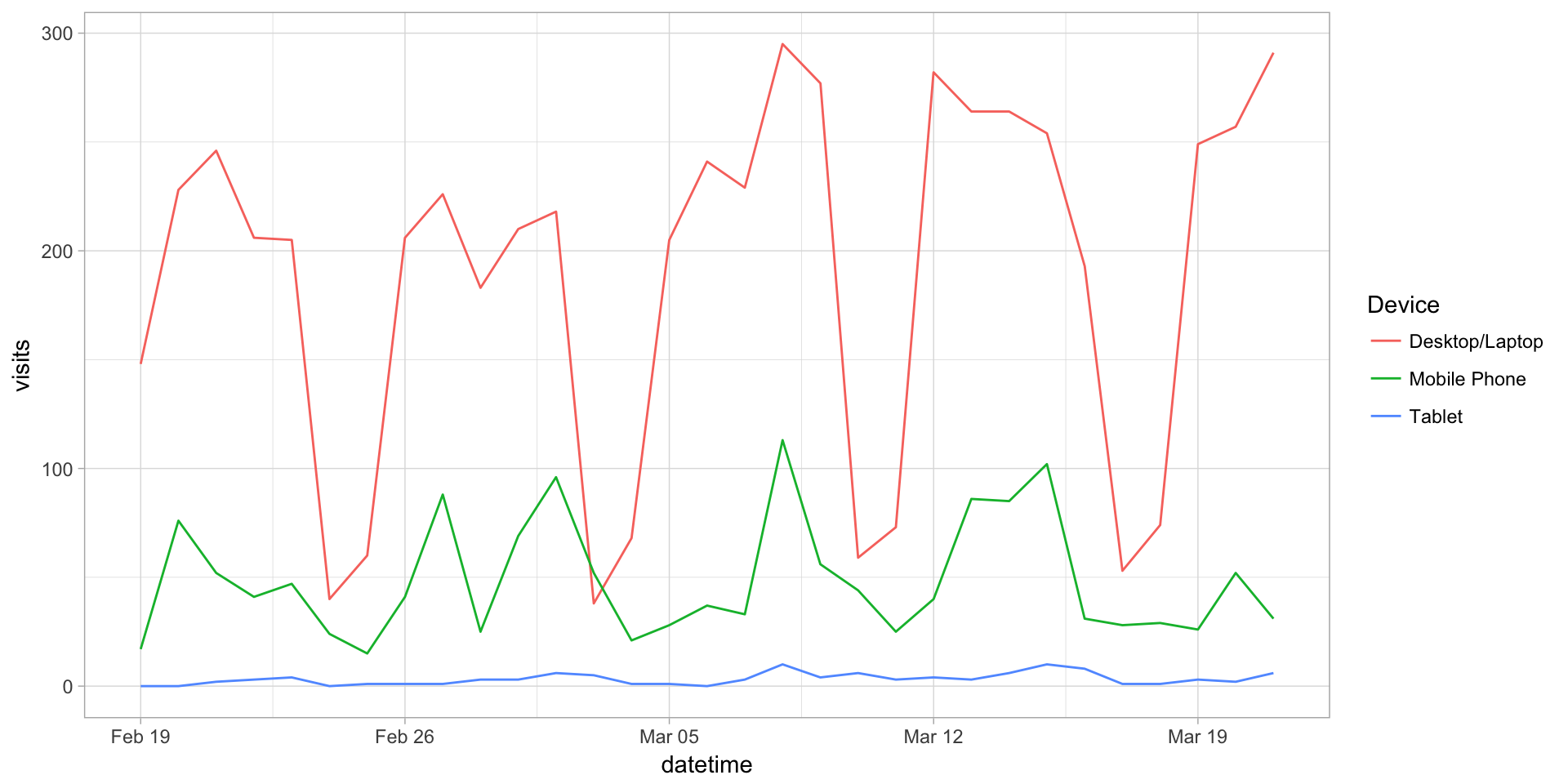
This site is a sub-site to dartistics.com