Example 1: Trending Google Analytics Sessions
This is a pretty straightforward example. It simply walks through getting daily sessions data from Google Analytics, and then a few different ways to trend it. Is it a sexy example? No. Or yes. You be the judge.
We first load the libraries we will need later, authenticate with Google, and set the View ID we want to pull data from. You can get the view ID for a specific view that you have access to by logging into the Google Analytics Query Explorer. It’s the “ids” value.
library(googleAnalyticsR)
library(knitr)
ga_auth()

# Replace with your own Google Analytics view ID
view_id <- 81416156
This is the actual API call. We take advantage of Google Analytics v4’s pivot function, to do some data transformation for us:
# Get the data. Use the "pivots" parameter to get columns of medium sessions.
trend_data <- google_analytics_4(view_id,
                                 date_range = c(Sys.Date() - 400, Sys.Date()),
                                 dimensions = c("date"),
                                 metrics = "sessions",
                                 pivots = pivot_ga4("medium","sessions"),
                                 max = -1)

# Note the medium columns that were created by using the pivots= setting
head(trend_data)| date | sessions | medium.referral.sessions | medium..none..sessions | medium.social.sessions |
|---|---|---|---|---|
| 2015-10-15 | 640 | 413 | 103 | 0 |
| 2015-10-16 | 273 | 142 | 74 | 0 |
| 2015-10-17 | 155 | 78 | 44 | 0 |
| 2015-10-18 | 109 | 52 | 29 | 0 |
| 2015-10-19 | 144 | 66 | 39 | 0 |
| 2015-10-20 | 118 | 47 | 29 | 0 |
Now we have the data, but we still need to transform it a little to a format suitable for the plot functions.
# The "names" are the column headings. Let's see what those are (these are the same as the headings
# in the table above -- we just want to double-check that that's what we're about to change).
names(trend_data)
## [1] "date" "sessions"
## [3] "medium.referral.sessions" "medium..none..sessions"
## [5] "medium.social.sessions"# Now, let's actually change those values to be a bit more user-friendly.
names(trend_data) <- c("Date","Total","Referral","Direct","Social")We’ve now updated the colum headings in our data:
| Date | Total | Referral | Direct | Social |
|---|---|---|---|---|
| 2015-10-15 | 640 | 413 | 103 | 0 |
| 2015-10-16 | 273 | 142 | 74 | 0 |
| 2015-10-17 | 155 | 78 | 44 | 0 |
| 2015-10-18 | 109 | 52 | 29 | 0 |
| 2015-10-19 | 144 | 66 | 39 | 0 |
| 2015-10-20 | 118 | 47 | 29 | 0 |
Let’s now plot the data a few different ways.
Base Plots
“Base R” includes plotting functionality. These are good for some quick explorations, but can take some pretty arcane work to make presentable for final publication.
# Plot the Total (total sessions) by date as a line chart (type = "l"). Oh... and we want to
# turn off the tick marks on the x-axis, which uses the oh-so-obvious "xaxt=" parameter
plot(Total ~ Date, data = trend_data, type = "l", xaxt="n")

# Now, add to that plot the x-axis using the date values and format them with the 3-letter
# month ("%b") and 2-digit year ("%y")
axis(1, trend_data$Date, format(trend_data$Date, "%b-%y"), tick = FALSE)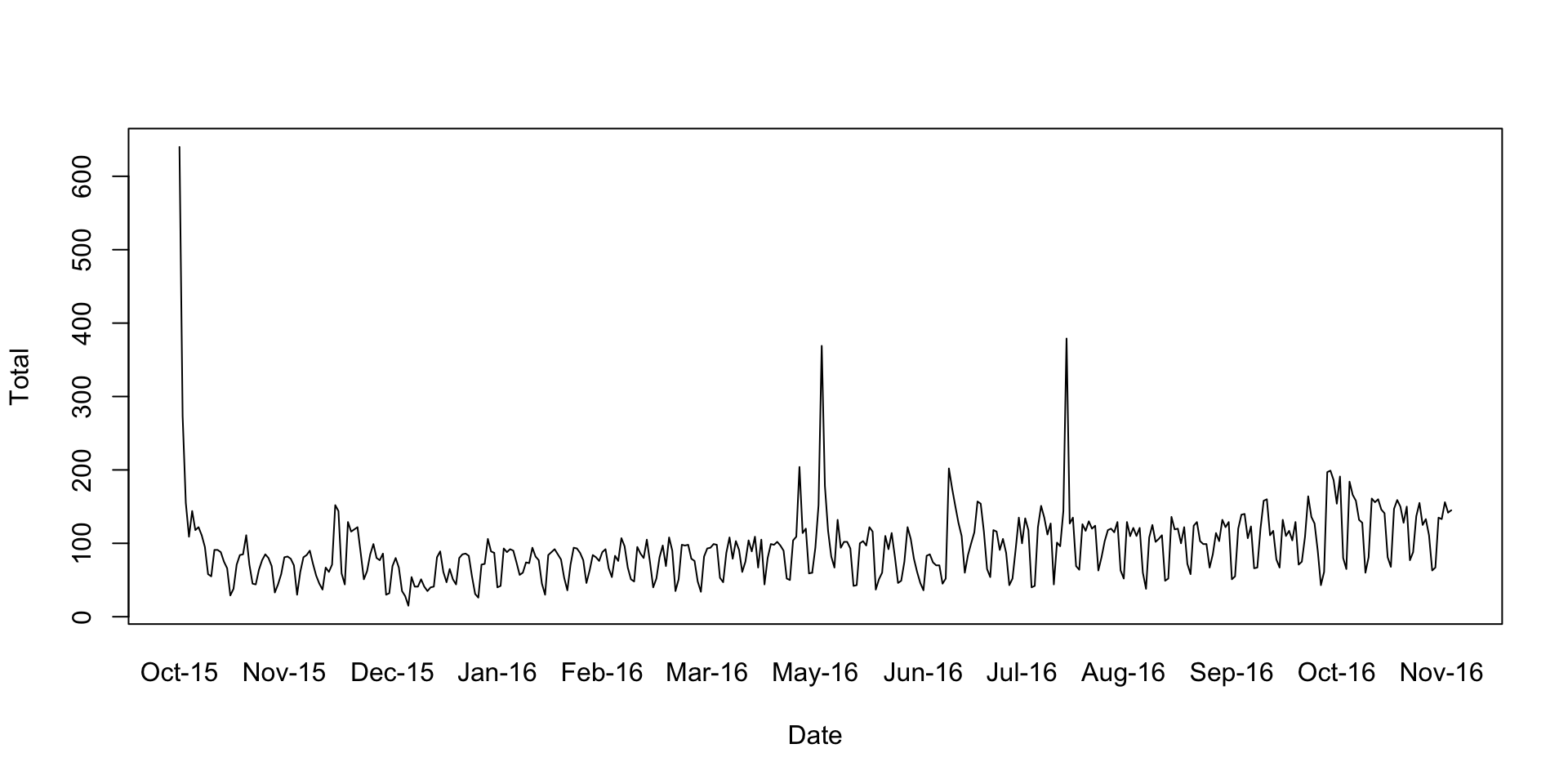
ggplot
ggplot is a separate R package for creating visualizations. The “gg” is for “Grammar of Graphics.” That “grammar” is very powerful, but it’s also a bit mind-bending to learn. You will need to learn the syntax, but, once you do, it’s more consistent across all visualizations than base R’s is.
Essentially, you slowly “build up” your plot via “geoms” (different core “geometries” – a line, a bar, a point, text, etc“), and you control the style through”themes" that are very similar to CSS in web development. The end results can be very professional looking.
library(ggplot2)
library(tidyr)

# Change the data into a 'long' format. This is "tidy data," which we'll cover
# elsewhere in more detail.
trend_long <- gather(trend_data, Channel, Sessions, -Date)

# Check out the first few rows of the 'long' version of the data
head(trend_long)
## Date Channel Sessions
## 1 2015-10-15 Total 640
## 2 2015-10-16 Total 273
## 3 2015-10-17 Total 155
## 4 2015-10-18 Total 109
## 5 2015-10-19 Total 144
## 6 2015-10-20 Total 118# Build up the plot.
# Create a basic plot object that says to use Sessions as the plotted variable, and to split
# out each Channel into a different data series. For now, don't actually *plot* it -- just
# make it a "plot object" that we're calling "gg" (we haven't yet said *how* to plot it --
# we've just sort of set up "here's the data and here's how we're looking at it.")
gg <- ggplot(trend_long, aes(x = Date, y = Sessions, group = Channel)) + theme_minimal()
# Now, add on to that base plot definition that we want to plot the results as a line chart,
# and we want to make each Channel's data a different color.
gg <- gg + geom_line(aes(colour = Channel))
# Finally, actually output the plot.
gg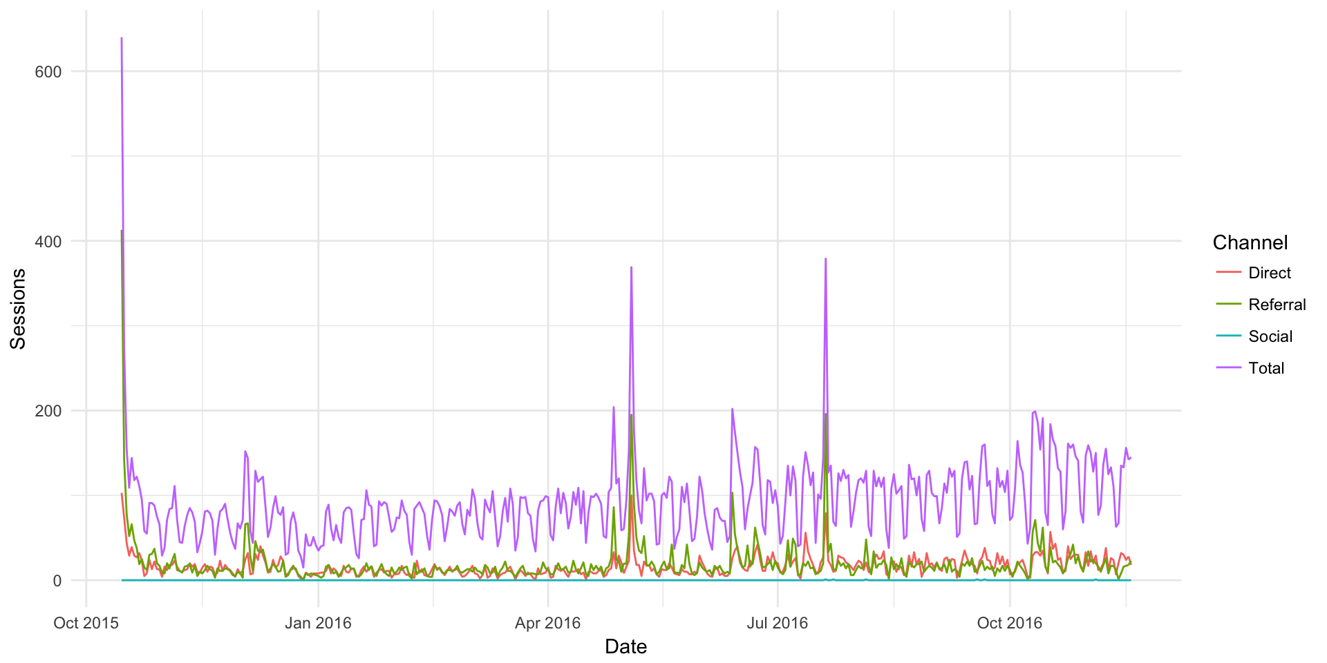
highcharter (Example of htmlwidgets)
The plot above is a static image. But, if we use JavaScript libraries to render the data, we get something that is more interactive (but only works in HTML). Note how you can mouse over the chart below and see the specific values.
library(highcharter)

# Use the hchart function to generate a line chart with the data.
hchart(trend_long, type = "line", hcaes(x = Date, y = Sessions, group = Channel))