Pivoting Data (after Querying)
This example pulls sessions by device category and medium and then displays them in a pivoted fashion. This is the highly attractive cousin of the pivot in the query itself example.
Setup/Config
Be sure you’ve completed the steps on the Initial Setup page before running this code.
For the setup, we’re going to load a few libraries, load our specific Google Analytics credentials, and then authorize with Google.
# Load the necessary libraries. These libraries aren't all necessarily required for every
# example, but, for simplicity's sake, we're going ahead and including them in every example.
# The "typical" way to load these is simply with "library([package name])." But, the handy
# thing about using the approach below -- which uses the pacman package -- is that it will
# check that each package exists and actually install any that are missing before loading
# the package.
if (!require("pacman")) install.packages("pacman")
pacman::p_load(googleAnalyticsR,  # How we actually get the Google Analytics data
               tidyverse,         # Includes dplyr, ggplot2, and others; very key!
               devtools,          # Generally handy
               googleVis,         # Useful for some of the visualizations
               scales)            # Useful for some number formatting in the visualizations

# Authorize GA. Depending on if you've done this already and a .ga-httr-oauth file has
# been saved or not, this may pop you over to a browser to authenticate.
ga_auth(token = ".ga-httr-oauth")

# Set the view ID and the date range. If you want to, you can swap out the Sys.getenv()
# call and just replace that with a hardcoded value for the view ID. And, the start
# and end date are currently set to choose the last 30 days, but those can be
# hardcoded as well.
view_id <- Sys.getenv("GA_VIEW_ID")
start_date <- Sys.Date() - 31        # 30 days back from yesterday
end_date <- Sys.Date() - 1           # Yesterday
If that all runs with just some messages but no errors, then you’re set for the next chunk of code: pulling the data.
Pull the Data
This is a simple query with just two dimensions and one metric.
# Pull the data. See ?google_analytics_4() for additional parameters. The anti_sample = TRUE
# parameter will slow the query down a smidge and isn't strictly necessary, but it will
# ensure you do not get sampled data.
ga_data <- google_analytics(viewId = view_id,
                              date_range = c(start_date, end_date),
                              metrics = "sessions",
                              dimensions = c("medium","deviceCategory"),
                              anti_sample = TRUE)

# Go ahead and do a quick inspection of the data that was returned. This isn't required,
# but it's a good check along the way.
head(ga_data)| medium | deviceCategory | sessions |
|---|---|---|
| (none) | desktop | 1122 |
| (none) | mobile | 283 |
| (none) | tablet | 22 |
| (not set) | desktop | 7 |
| display | desktop | 44 |
| display | mobile | 25 |
Data Munging
To pivot the data, we can use the spread() function in dplyr. This will give us pivoted data in a data frame.
# Pivot the data
ga_data_pivoted <- ga_data %>%
  spread(deviceCategory, sessions)

# Check out the result of our handiwork
head(ga_data_pivoted)| medium | desktop | mobile | tablet |
|---|---|---|---|
| (none) | 1122 | 283 | 22 |
| (not set) | 7 | NA | NA |
| display | 44 | 25 | 2 |
| 24 | 7 | NA | |
| organic | 2550 | 293 | 34 |
| partner | 2 | NA | NA |
Data Visualization
If we wanted a pivoted “visualization” – not just a data frame – then we actually can just use ggplot2 with the unpivoted data.
To spice things up just a bit, let’s make a little heatmap of the data (in a “pivoted” layout). This requires two “geoms” – geom_tile() to make the heatmap (the shaded grid), and then geom_text() to actually put the values in the heatmap. Note: this uses the ga_data data frame that was pulled initially – not the ga_data_pivoted data frame that we created above. This is a subtle illustration of the elegance of the tidyverse, including ggplot2. If you appreciate that elegance, you are well on your way to R mastery.
The use of the format() function in the label argument is a handy little way to get commas displayed in numbers as the 000s separator (which means it’s easy to swap out if you’re in a locale where that is not the convention).
Note that there is not a logical/appropriate arrangement of the rows and columns, and the formatting is only minimally tweaked. This is one of the things addressed in the intermediate-level version of this example.
# Create the plot
gg <- ggplot(ga_data, mapping=aes(x = deviceCategory, y = medium)) +
  geom_tile(aes(fill = sessions)) +
  geom_text(aes(label = format(sessions, big.mark = ","))) +
  scale_fill_gradient(low = "white", high = "green") +
  theme_light() +
  theme(panel.grid = element_blank(),
        panel.border = element_blank(),
        axis.ticks = element_blank())

# Output the plot. You *could* just remove the "gg <-" in the code above, but it's
# generally a best practice to create a plot object and then output it, rather than
# outputting it on the fly.
gg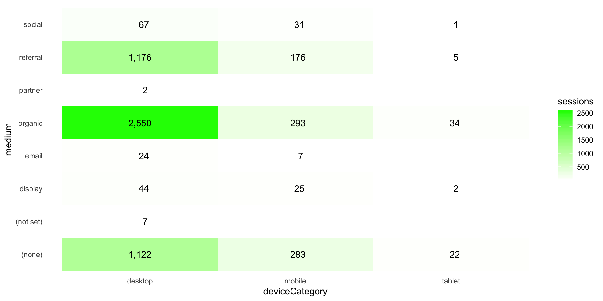
This site is a sub-site to dartistics.com