Correlation
In the Nature of Data, we explore nonmetric data (e.g., nominal, interval) and metric data (e.g., interval, ratio).
In Cross Tabulations with a \(\chi2\) Test for Independence, we test the relationship between two nominal variables with at least two levels.
In 1-way ANOVA, we test the relationship between at least one independent variable that is nominal in nature with at least two levels and one dependent variable that is interval or ratio in nature. In n-way ANOVA, we add two independent variables, which remain nominal in nature.
In this document, we will add another test for a relationship between variables as well as a test for prediction.
Correlation is a number that describes how strong of a relationship there is between two variables.
In digital analytics terms, you can use it to explore relationships between web metrics to see if an influence can be inferred, but be careful to not hastily jump to conclusions that do not account for other factors.
For instance, a high correlation between social shares and SEO position could mean:
- Social shares influence SEO position
- SEO position influences social shares
- Social shares and SEO position are influenced by a third factor (such as Brand strength)
- The relationship was a chance error
It is, unfortunately, pretty common to see something like the first bullet used as the sole interpretation of a correlation, which is problematic for two reasons:
- There might be other factors in play (the other bullets in the list!)
- Correlation is not necessarily a sign of causation.
But, still, correlation can be very useful: identifying that a relationship exists can be a great place to start looking for the underlying drivers of that relationship which, ultimately, can lead to an insight than can drive an action!
The Basics of Correlation
Correlation refers to a value, \(r\), that provides insight into the relationship between two variables. This mathematical formula goes by many names including Pearson product moment correlation, bivariate correlation, Pearson’s r, and others.
Mathematically, the correlation coefficient is determined by
- Summing the product of standardized score for \(X_1\) variable and standardized score for a corresponding \(X_2\) variable, and then
- Dividing by the number of paired \(X_1X_2\). Most statistical packages, including Excel, Minitab, R, SAS, and SPSS quickly, easily, and painlessly perform this calculation.
At this point, we will stop discussing the mathematical formula and instead focus on the output and the ensuing interpretation. However, we will come back to the correlation coefficient, \(r\), when we discuss regression.
In this example, we will consider five metric variables, including:
- Average amount spent per transactions
- Number of transactions
- Number of pages viewed
- Number of unique visitors by week
- Size of discount (e.g., 50% off, $10 off)
All of these numbers are fake and are used for only illustrative purposes. Proceed with that caveat.
| Average Amount Spent per Transaction |
Number of Transactions |
Number of Pages Viewed |
Number of Users by Week |
Size of Discount |
|
|---|---|---|---|---|---|
| Average Amount Spent Per Transaction |
1.00 | ||||
| Number of Transaction | 0.89 | 1.00 | |||
| Number of Pages Viewed | 0.43 | 0.29 | 1.00 | ||
| Number of Users by Week | 0.67 | 0.92 | 0.75 | 1.00 | |
| Size of Discount | 0.32 | 0.71 | 0.19 | 0.93 | 1.00 |
All the correlation coefficient values shown in Table 1 appear positive. As \(X_1\) moves in a positive direction (out from the origin on the X axis), another variable (e.g., number of unique pages visited or \(X_3\)) moves in a positive (up from the origin on the Y axis) direction. Conversely, negative correlation coefficient values would be interpreted as \(X_1\) moves in a positive direction (out from the origin on the X axis), \(X_3\) moves in a negative direction (down toward the origin on the Y axis).
Correlation coefficient values range from -1.00 to 1.00 with 0.00 interpreted perfectly unrelated, -1.00 perfectly negatively related, and 1.00 perfectly positively related. Most analysts will not observe a 0, -1, and/or 1 (
| High.Value | Low.Value | Interpretation |
|---|---|---|
| 1.00 | 0.80 | Danger! Collinearity! |
| 0.79 | 0.60 | Strong relationship |
| 0.59 | 0.40 | Moderate relationship |
| 0.39 | 0.20 | Weak relationship |
| ~0.20 | ~-0.20 | Crud relationship |
| -0.39 | -0.20 | Weak relationship |
| -0.59 | -0.40 | Moderate relationship |
| -0.79 | -0.60 | Strong relationship |
| -1.00 | -0.80 | Danger! Collinearity! |
“Crud factor” comes from philosopher Paul Mehl, who noted that everything is correlated with everything at least 0.2. In our example, the number of pages viewed and size of discount appears as a crud relationship.
Collinearity refers to measuring the same variable twice. It presents problems in regression analysis. In our example, the number of users and size of discount seems collinear. The analyst should investigate this issue later in the regression analysis.
The Null Hypothesis (\(H_0\))
The null hypothesis, or testable statement, is there there is no relationship between these two variables. This null hypothesis appears similar to the null hypothesis from cross tabulation with a \(\chi^2\) test for independence. However, unlike a cross tabulation with a \(\chi^2\) test for independence, the correlation test is rho (\(\rho\)) equals 0. Rho refers to the coefficient of the population.
Other Types of Correlation
There are a number of different types of correlation:
Point Biserial correlation refers to including a dichotomous or binary variable (e.g., yes/no, on/off) (i.e., nonmetric data) with an interval or ratio variable (i.e., metric data). The interpretation changes to: as we move from no (or off) to yes (or on) then the other variable moves in a positive (or negative) direction.
Spearman Rho correlation is used to find a relationship between two ordinal variables. For examples, a web analyst wants to compare page ranks from Google to Bing. Spearman Rho correlation could explain how related the two ranks are.
Phi correlation is applied to understand the relationship between two dichotomous or binary variables. Instead of a Phi correlation, the digital analyst is better off setting up a cross tabulation with a chi square test for independence.
Performing correlation analysis in R
The base function cor() will perform correlations on a data.frame. Let’s give this a go with some data.
This exercise requires having a web_data data frame. You can either load up some sample data by completing the I/O Exercise (which is what is shown in the step-by-step instructions below), or, if you have access to a Google Analytics account, you can use your own data by following the steps on the Google Analytics API page. Or, if you have access to an Adobe Analytics account, then you can use your own data by following the Generating web_data steps on the Adobe Analytics API page.
web_data data frame to work with, the command head(web_data) should return a table that, at least structurally, looks something like this:
| date | channelGrouping | deviceCategory | sessions | pageviews | entrances | bounces |
|---|---|---|---|---|---|---|
| 2016-01-01 | (Other) | desktop | 19 | 23 | 19 | 15 |
| 2016-01-01 | (Other) | mobile | 112 | 162 | 112 | 82 |
| 2016-01-01 | (Other) | tablet | 24 | 41 | 24 | 19 |
Let’s correlate!
Correlations will only work with numeric data, so we subset to just those columns and then run the base R function cor() to see a correlation table:
web_data_metrics <- web_data[,c("sessions","pageviews","entrances","bounces")]
## see correlation between all metrics
kable(cor(web_data_metrics))| sessions | pageviews | entrances | bounces | |
|---|---|---|---|---|
| sessions | 1.0000000 | 0.8384321 | 0.9999923 | 0.9411201 |
| pageviews | 0.8384321 | 1.0000000 | 0.8377078 | 0.6364753 |
| entrances | 0.9999923 | 0.8377078 | 1.0000000 | 0.9416535 |
| bounces | 0.9411201 | 0.6364753 | 0.9416535 | 1.0000000 |
The table is mirrored in the diagonal and provides the correlation coefficient (aka, “\(r\)”) between each pair of values that intersect in the cell. 1 means a perfect correlation, 0 means no correlation and -1 means a perfect negative correlation.
Does the R that we’re working on learning today have anything to do with the correlation coefficient \(r\)? Well…no. Or, at least, only to the extent that you can use R-the-platform to calculate r-the-correlation-coefficient. Good question, though!
When working with correlations, its always a good idea to view an exploratory plot. A handy function for this is pairs() which creates a scatter plot of all the metrics passed in combination:
pairs(web_data_metrics)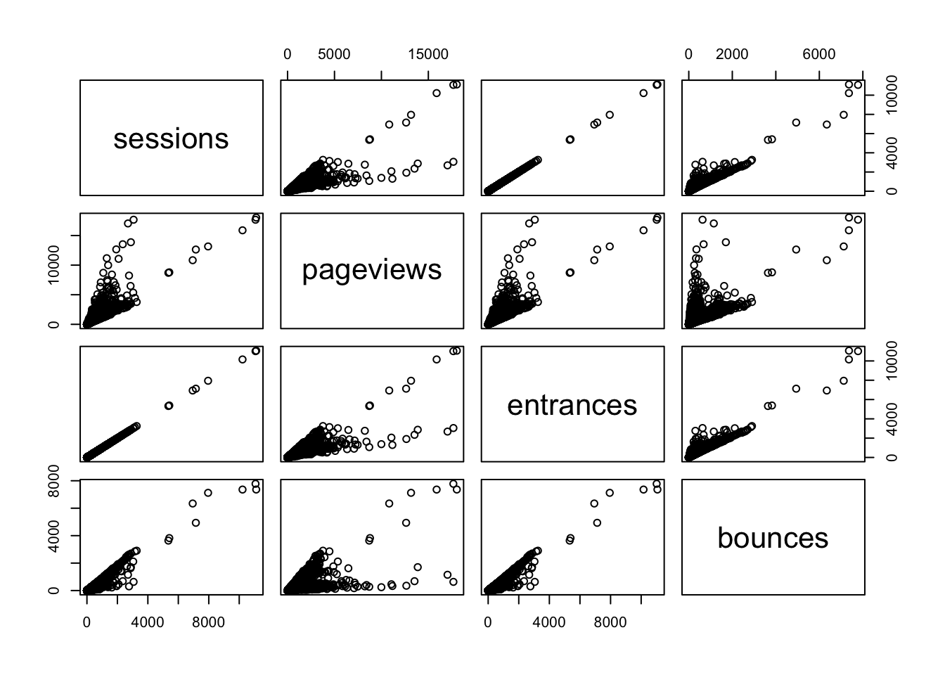
Here you can see the correlation numbers in graphical form. For instance, the high correlation of 0.9999923 between sessions and entrances results in an almost perfect straight line. Since a session starts with an entrance, this makes perfect sense! A correlation of less than 1 may be a quick diagnostic that something is wrong with the tracking.
How do web channels correlate?
One useful piece of analysis is seeing how web channels possibly interact.
Data Prep
To get the data in the right format, the below code pivots via the reshape2 package:
## Use tidyverse to pivot the data
library(dplyr)
library(tidyr)

## Get only desktop rows, and the date, channelGrouping and sessions columns
pivoted <- web_data %>%
  filter(deviceCategory == "desktop") %>%
  select(date, channelGrouping, sessions) %>%
  spread(channelGrouping, sessions)

## Get rid of any NA's and replace with 0
pivoted[is.na(pivoted)] <- 0

kable(head(pivoted))| date | (Other) | Direct | Display | Organic Search | Paid Search | Referral | Social | Video | |
|---|---|---|---|---|---|---|---|---|---|
| 2016-01-01 | 19 | 133 | 307 | 17 | 431 | 555 | 131 | 68 | 0 |
| 2016-01-02 | 156 | 1003 | 196 | 43 | 1077 | 1060 | 226 | 158 | 3 |
| 2016-01-03 | 35 | 1470 | 235 | 29 | 696 | 489 | 179 | 66 | 90 |
| 2016-01-04 | 31 | 1794 | 321 | 70 | 1075 | 558 | 235 | 46 | 898 |
| 2016-01-05 | 27 | 1899 | 309 | 74 | 1004 | 478 | 218 | 47 | 461 |
| 2016-01-06 | 21 | 1972 | 204 | 299 | 974 | 494 | 246 | 47 | 418 |
Take a minute to examine what the pivoted data looks like? Is it tidy data? Not exactly. But, that’s good! In one since, we’ve got separate “metrics” for each day now – the channelGrouping-sessions combination.
Examining the Data
We can plot and correlate all the metrics for an overview. Because we don’t want to do exactly the same thing as we did earlier (where’s the fun in that?!), let’s go ahead and round the correlation coefficients to two decimal places using the round() function. Other than that, we’ll do exactly what we already did when we were simply correlating the metrics in our data set:
## can't include the date as its not numeric, so remove
cor_data <- pivoted[, -1]
## not including first column, so -1 subset
cor_table <- round(cor(cor_data),2)
kable(cor_table)| (Other) | Direct | Display | Organic Search | Paid Search | Referral | Social | Video | ||
|---|---|---|---|---|---|---|---|---|---|
| (Other) | 1.00 | 0.13 | 0.12 | 0.09 | 0.17 | 0.03 | -0.04 | 0.46 | 0.37 |
| Direct | 0.13 | 1.00 | 0.04 | 0.07 | 0.22 | -0.02 | 0.09 | -0.05 | 0.01 |
| Display | 0.12 | 0.04 | 1.00 | 0.01 | -0.05 | 0.05 | -0.10 | 0.19 | 0.27 |
| 0.09 | 0.07 | 0.01 | 1.00 | 0.26 | 0.03 | 0.13 | 0.03 | 0.13 | |
| Organic Search | 0.17 | 0.22 | -0.05 | 0.26 | 1.00 | 0.51 | 0.19 | -0.04 | 0.08 |
| Paid Search | 0.03 | -0.02 | 0.05 | 0.03 | 0.51 | 1.00 | 0.08 | -0.01 | 0.22 |
| Referral | -0.04 | 0.09 | -0.10 | 0.13 | 0.19 | 0.08 | 1.00 | -0.11 | -0.25 |
| Social | 0.46 | -0.05 | 0.19 | 0.03 | -0.04 | -0.01 | -0.11 | 1.00 | 0.50 |
| Video | 0.37 | 0.01 | 0.27 | 0.13 | 0.08 | 0.22 | -0.25 | 0.50 | 1.00 |
pairs(cor_data)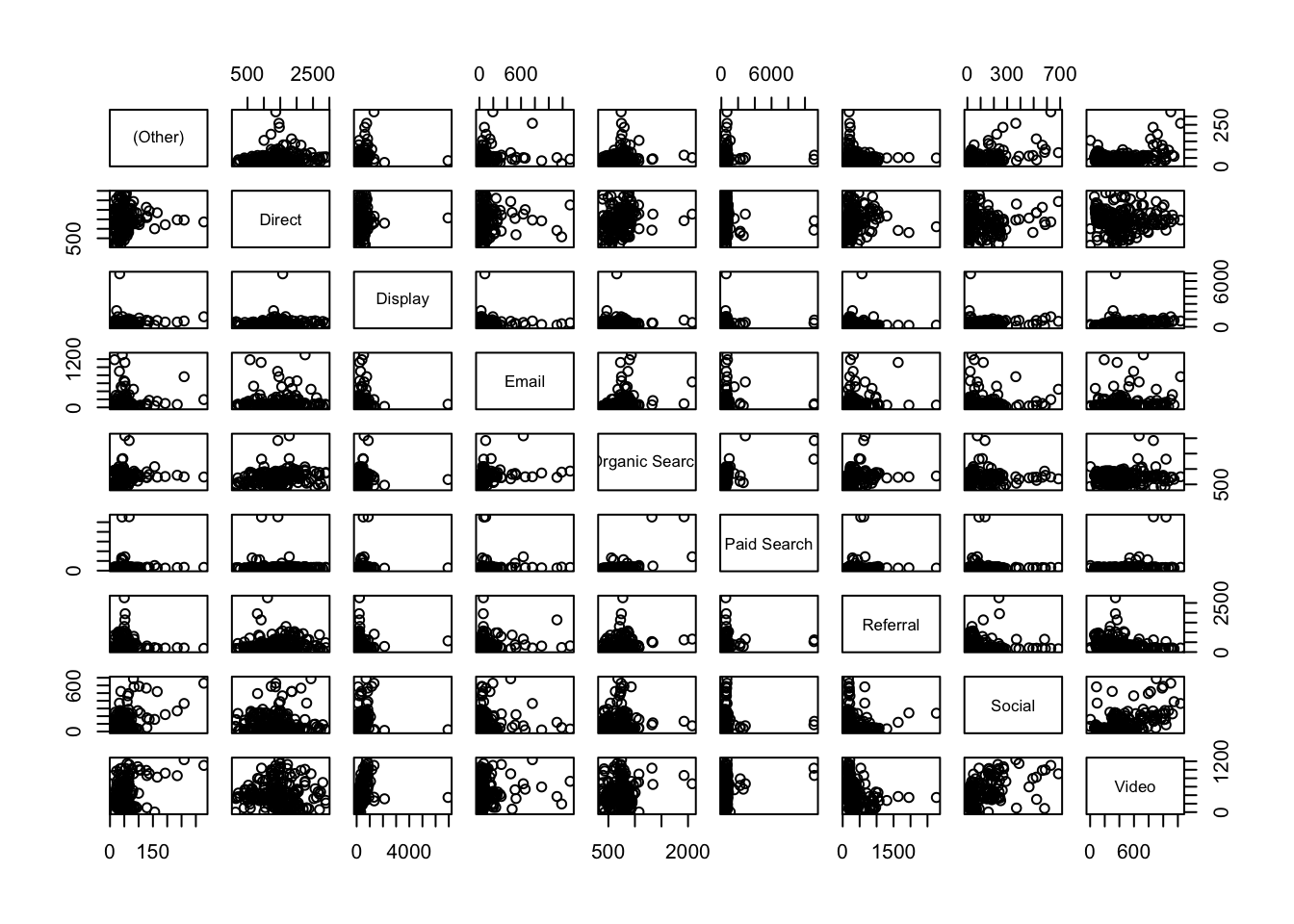
Analysis
Now, when we compare channels, we see much looser correlations for this dataset, which makes sense, right? Correlations under 0.3 are, as a rule-of-thumb, not worth considering, so the standouts look to be Social vs. Video* and Paid** vs. Organic Search.
Plotting those channels, we can examine the trends to see the shape of the data
Correlation has help us zero in on possibly interesting relationships
library(ggplot2)
gg <- ggplot(data = pivoted) +
      theme_minimal() +
      ggtitle("Paid (blue) vs Organic (green) search")
gg <- gg +
      geom_line(aes(x = as.Date(date), y = `Paid Search`), col = "blue")

gg + geom_line(aes(x = as.Date(date), y = `Organic Search`), col = "green")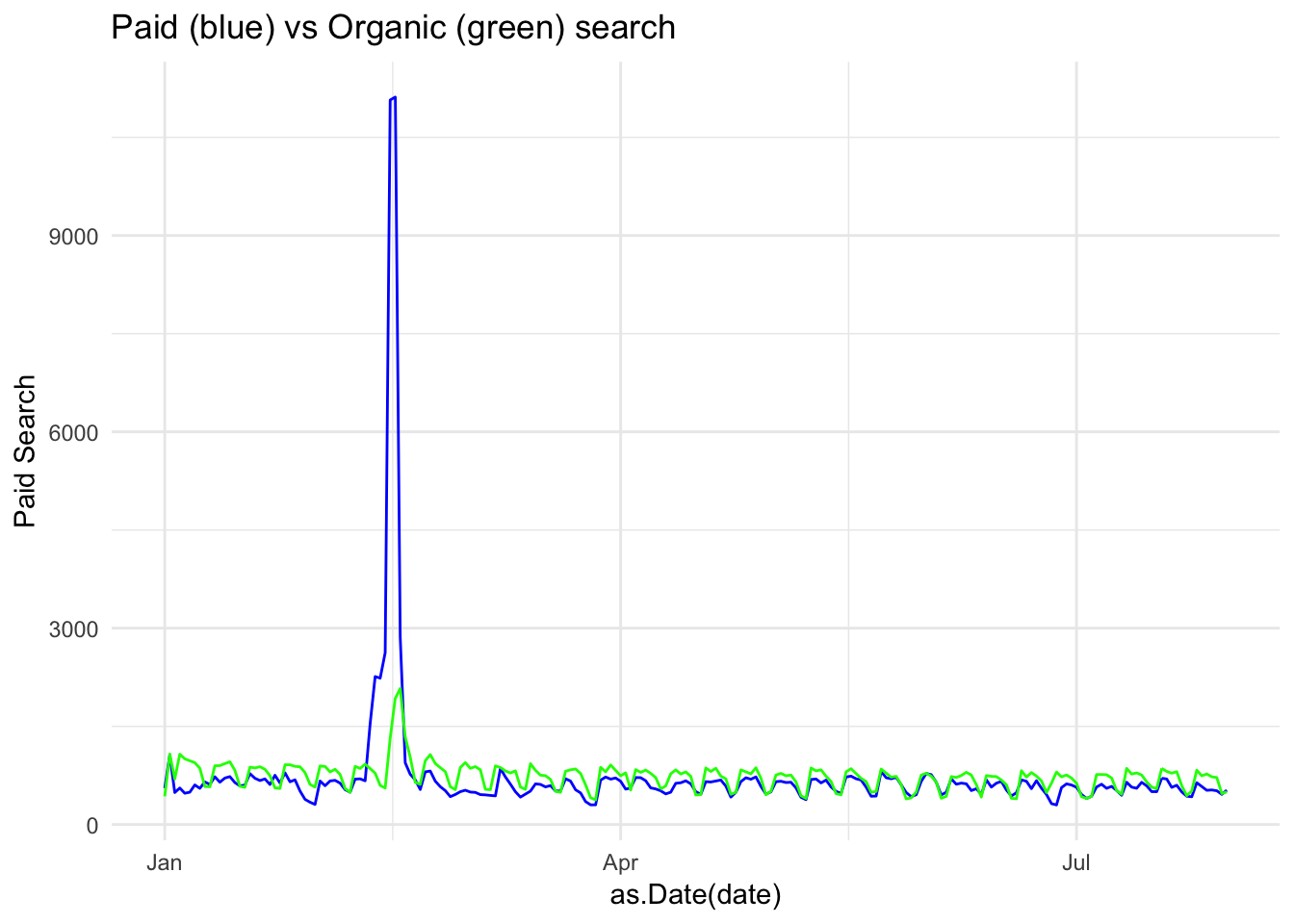
We can see here the trends do look similar, but with a paid search peak in the first quarter (as we look at this, we might want to consider these spikes as outliers – either simply by the visual or using a more defined method for detecting outliers; it would be quite simple to remove this data from the data set and run the analysis again…but we’re not going to go down that particular rabbit hole right now).
library(ggplot2)
gg <- ggplot(data = pivoted) +
              theme_minimal() +
              ggtitle("Social (red) vs Video (orange)")
gg <- gg +
      geom_line(aes(x = as.Date(date), y = Social), col = "red")
gg + geom_line(aes(x = as.Date(date), y = Video), col = "orange")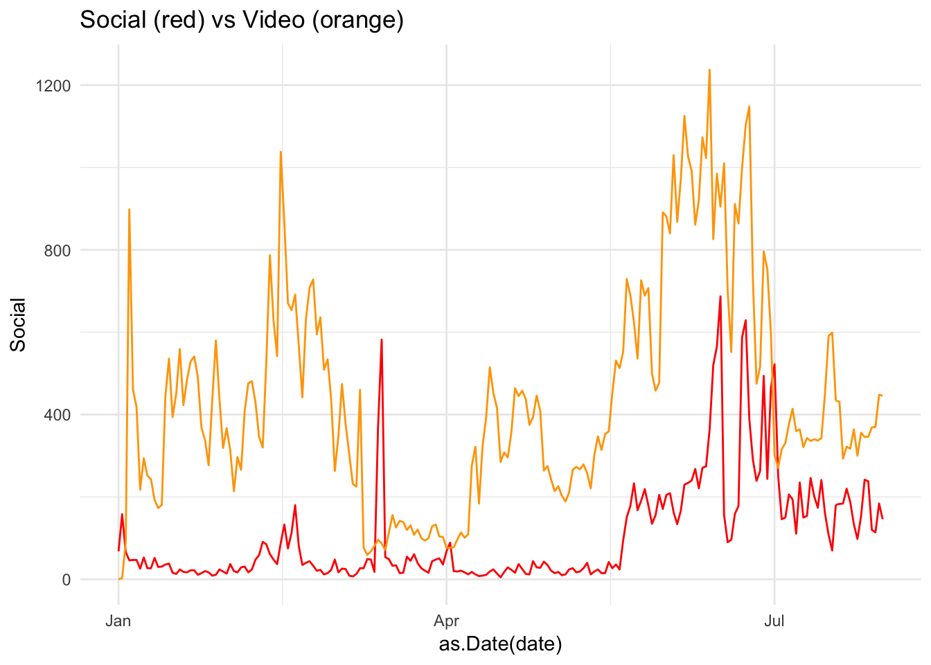
Here, a peak in Social late in the year looks to have coincided with a peak in Video: possibly a campaign driving video views?
Cross correlation
The correlations, above all, compare the same date point, but what if you expect a lagged effect? Perhaps the video traffic drove social traffic later on due to client advocacy?
Cross correlations are useful when dealing with time-series data and can examine if a metric has an influence on itself or another after some time has passed.
This can be a powerful way to find if, say, a TV or Display campaign increased SEO traffic over the course of the few weeks following the campaign.
The below compares paid search on SEO using the ccf() function. The result is the correlation for different lags of days. We can see a correlation at 0 lag at around 0.5, but the correlation increases if you lag the Social trend up to 10 days before.
ccf(pivoted$Social, pivoted$Video)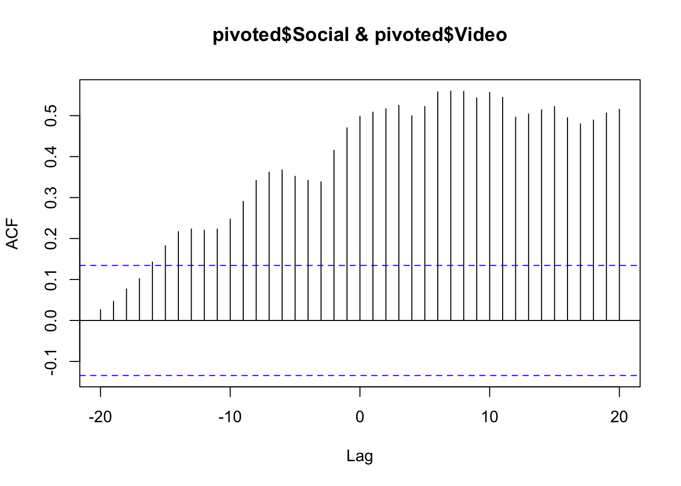
You could then conclude that Video was having a lagged effect on Social traffic up to 10 days beforehand. But, beware! The nature of cross-correlation is that if both datasets have a similar looking spike, cross-correlation will highlight it. Careful examination of the raw data trends should be performed to verify it. In some cases a smoother line will help get rid of spikes that affect the data (e.g., do the analysis on weekly or monthly data instead of daily). And, of course, there is no substitue for rational thought: if you find a relationship like this, can you explain it rationally? And, if so, can you conduct further analysis to validate that rationalization? (If only R had an Easy Button to do the actual thinking, too. Alas!)