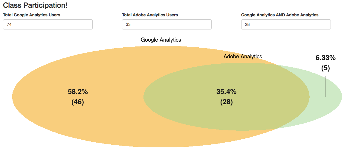
Example 3: Venn Diagram
This is an example of a visualization built using shiny (web-enablement) that was then repurposed for an entirely different use.
The first example, shown below, is available at https://gilligan.shinyapps.io/eMetrics_Venn/, if you want to try it out.
shiny apps historically required two files, although the package has been updated to enable using a single file.
The Code
server.R
The code that runs behind the scenes (note that most of the code is really just setting up the formatting options for the Venn diagram itself):
library(shiny)
library(VennDiagram)

shinyServer(function(input, output) {

  output$vennDiagram <- renderPlot({

    # Only plot the Venn diagram if the input values are legit (the input values
    # are all available and the intersection area isn't greater than either individual set).
    if(as.numeric(req(input$adobeGoogle)) <= as.numeric(req(input$adobe)) &&
       as.numeric(req(input$adobeGoogle)) <= as.numeric(req(input$google))){

      draw.pairwise.venn(area1 = as.numeric(input$google),
                         area2 = as.numeric(input$adobe),
                         cross.area = as.numeric(input$adobeGoogle),
                         category = c("Google Analytics","Adobe Analytics"),
                         fill = c("#F29B05","#A1D490"),
                         ext.text = TRUE,
                         ext.percent = c(0.1,0.1,0.1),
                         ext.length = 0.6,
                         label.col = rep("gray10",3),
                         lwd = 0,
                         cex = 2,
                         fontface = rep("bold",3),
                         fontfamily = rep("sans",3),
                         cat.cex = 1.5,
                         cat.fontface = rep("plain",2),
                         cat.fontfamily = rep("sans",2),
                         cat.pos = c(0, 0),
                         print.mode = c("percent","raw")
                         )
    }
  })
})
ui.R
The code for the user interface:
library(shiny)

shinyUI(fluidPage(

  # Application title
  titlePanel(h3("Class Participation!")),

  # Sidebar with a slider input for number of bins
  fluidRow(
    column(4,numericInput("google", label = "Total Google Analytics Users", value = NULL)),
    column(4,numericInput("adobe", label = "Total Adobe Analytics Users", value = NULL)),
    column(4,numericInput("adobeGoogle", label = "Google Analytics AND Adobe Analytics", value = NULL))
    ),

    # Show a plot of the generated distribution
  fluidRow(
      column(12,plotOutput("vennDiagram"))
    )
  )
)
Repurposing to Use Segments
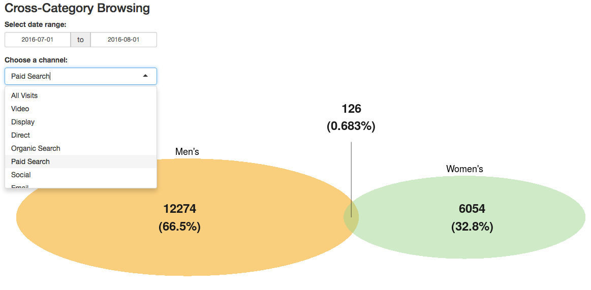
The example above, obviously, was just a demo for a conference presentation. But, the demo was actually inspired by a real-world use case, which is the visualization of two different segments of traffic to a site.
This example is available at https://gilligan.shinyapps.io/segmentsVenn/.
It shows the volume of sessions from each segment and the degree to which traffic fell in both segments (the overlapping area), and provides the user with two settings that trigger a re-query of the data and an update of the diagram:
- Changing the date range
- Choosing a channel